AlpineOffice
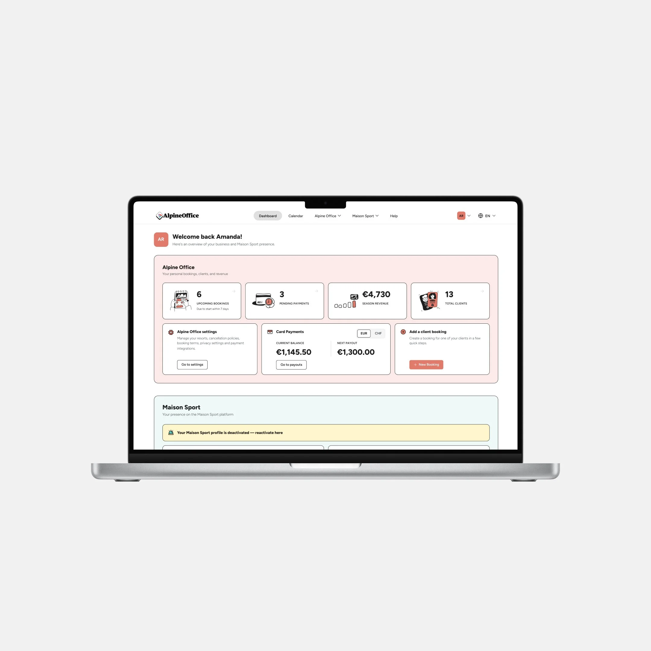
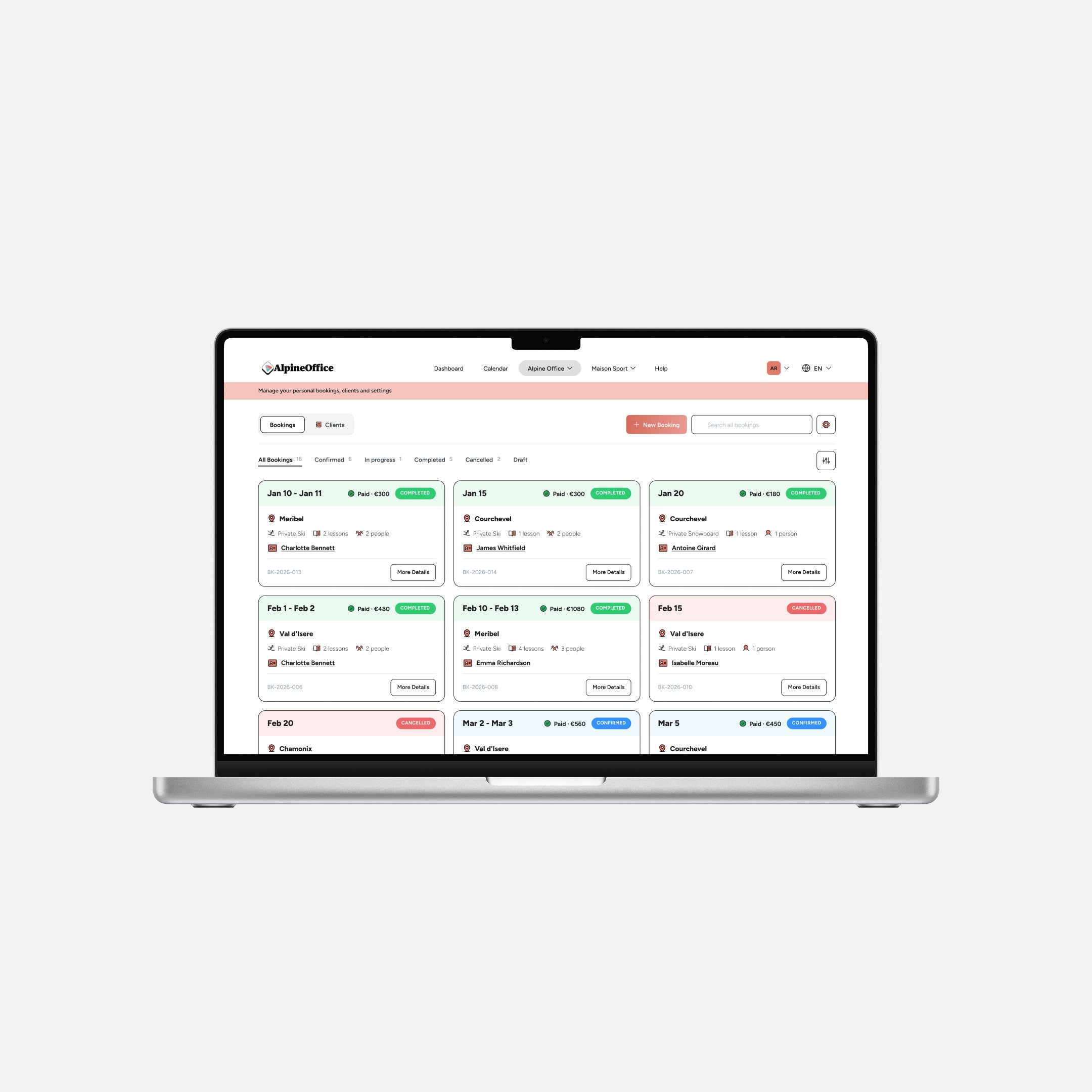
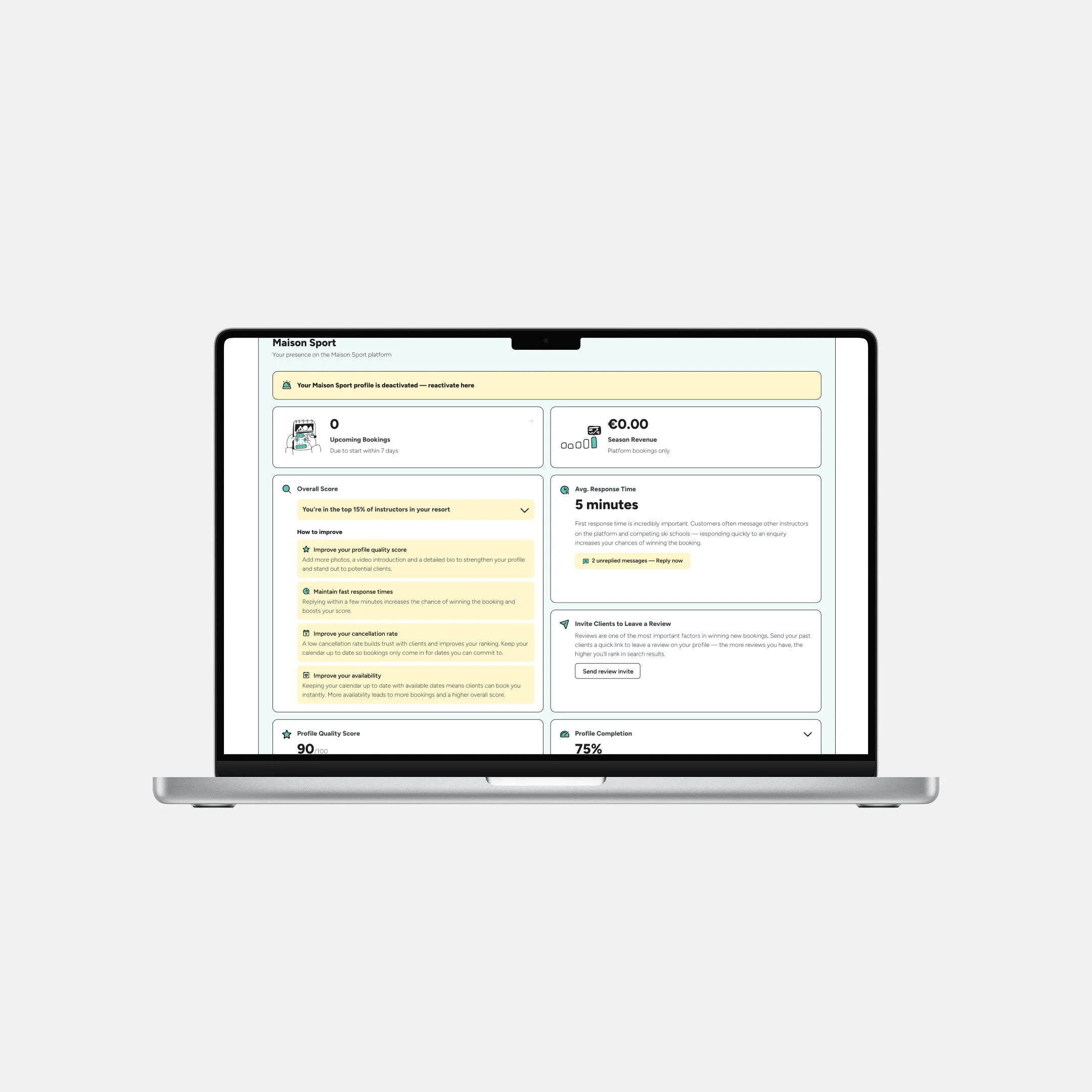
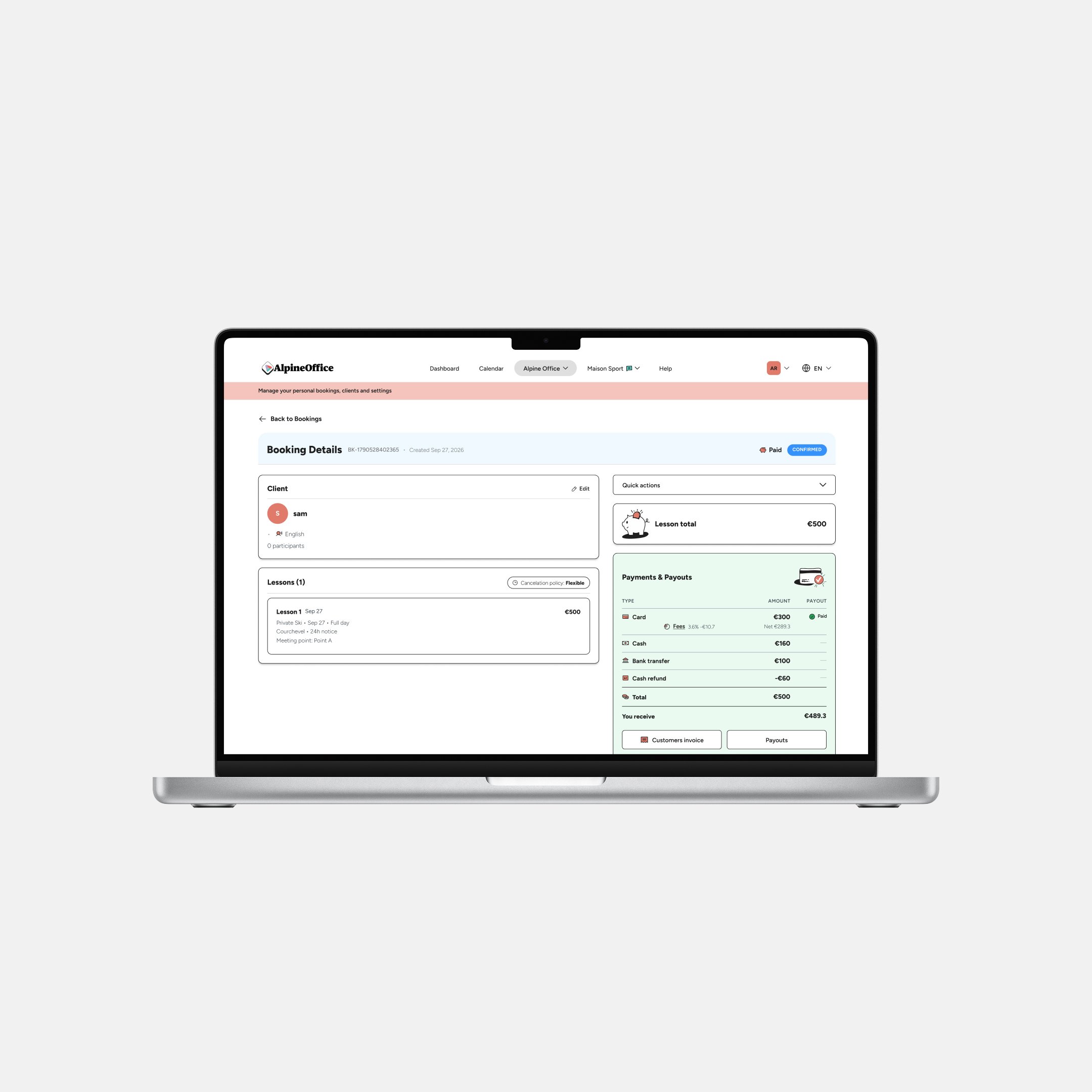
AlpineOffice is a brand-new platform, part of Maison Sport. It gives instructors, on or off the platform, one place to manage their season's bookings, no more juggling spreadsheets and different communication tools. Independent instructors on Maison Sport can link the two, giving them a single calendar for all their bookings.
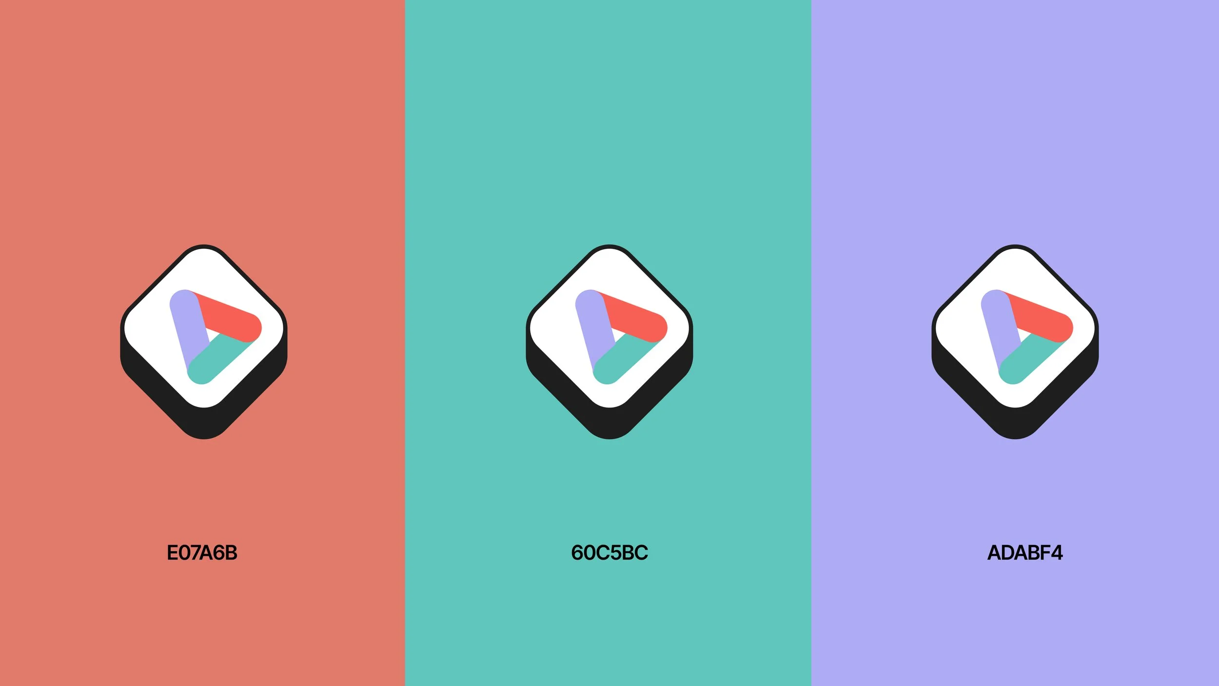
The project came with real challenges. The two brands needed to coexist, so wayfinding became key: the logo evolved into a Penrose triangle, its three parts, independent instructors, ski schools, and the platform itself, each needing the others to exist. That interdependence gave the mark its shape.
Colour carried the same logic. Every colour connected to Maison Sport is pulled from its existing palette, with one new colour added for AlpineOffice, keeping the new platform feeling distinct and separate rather than folded into Maison Sport.
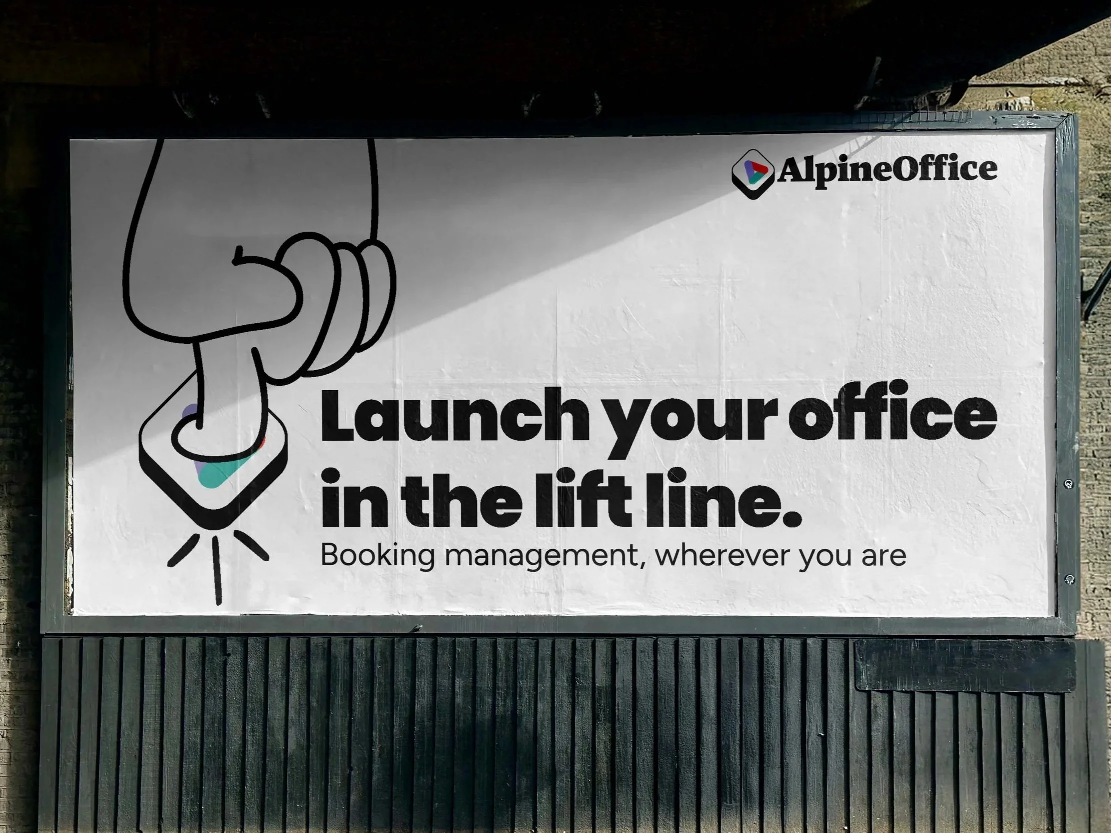
Then came a curveball: a name change midway through. Rather than pushing against it, I leant in, and it became core to the brand's tone of voice. A key felt like the right idea, pushing the word "office" forward while giving a silent nod back to Maison Sport, built from both logos.
"Office" is also the last word a ski instructor wants to hear; these are people who chose a life on the mountain to escape that world. So instead of ignoring the tension, I leant into it: "office" becomes something you launch, not somewhere you're trapped. Your office doesn't have four walls, it has a chairlift, a gondola, a queue for hot chocolate. That reframe is where the visual identity found its personality.